


Is COVID-19 getting better or worse?
Notes
Is COVID-19 getting better or worse in your part of the world?
It’s difficult to exaggerate how important it is to know whether the COVID-19 situation is getting better or worse. If it’s getting better – if there are fewer deaths each week – then the measures we’re taking are sufficient to keep the virus in check, for now. If it’s getting worse – if there are more deaths each week – then we urgently need to take more stringent measures to contain the virus.
This chart aims to make it clear. Select your country or region from the drop-down. If the line for your country is in the red zone, things are getting worse (towards the top of the red zone, a lot worse: ten times more deaths week-on-week). If it’s in the green zone, things are getting better.
This crucial information is impossible to glean from most COVID-19 charts.
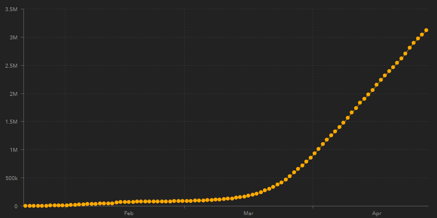
Take this chart from the COVID-19 Dashboard by the Center for Systems Science and Engineering (CSSE) at Johns Hopkins University (JHU):
Or this tiny chart from the Government of Canada’s Coronavirus disease (COVID-19) Outbreak update:
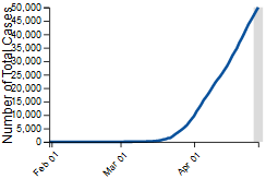
Like most COVID-19 charts, whether from governments, universities or newspapers, these soar alarmingly up and to the right.
There’s a reason for this. Whether their publishers make it explicit or not, these charts show cumulative numbers of cases or deaths, which will always be up and to the right.
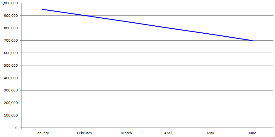
To understand how horribly misleading this is, imagine I ran a business with declining sales: suppose I made $950,000 sales in January, $900,000 in February, $850,000 in March, and so on down. Clearly, I’ll be out of business pretty quickly, as my sales chart shows:
However, if I wanted to change the poor impression given by this sales chart, perhaps to impress potential investors, I could simply change it to show cumulative sales:
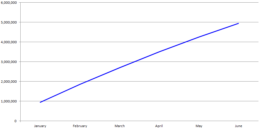
This is a much more impressive chart: up and to the right! I’d be sure to win over those investors! The trouble is, it’s fraudulent. By showing cumulative sales, I’m counting each month’s sales over and over again: in February, I’m including the sales for both January and February; in March, I’m counting the sales for January and February and March. It’s up and to the right because cumulative charts are always up and to the right: even when my sales have fallen to zero and my business is bankrupt, it’ll still show impressively high sales.
It’s the same with the COVID-19 charts: even when the last case of COVID-19 is a distant memory, the charts from Johns Hopkins University and the Government of Canada will still show alarmingly high numbers of cases. Like my up-and-to-the-right sales chart, these COVID-19 charts are deeply misleading: when COVID-19 is over, the charts should show the number of cases falling to zero, not remaining forever at a high plateau.
There are other problems with these COVID-19 charts. Take this chart of daily death tolls from the Financial Times, whose egregious cumulative COVID-19 chart went viral earlier in the pandemic:
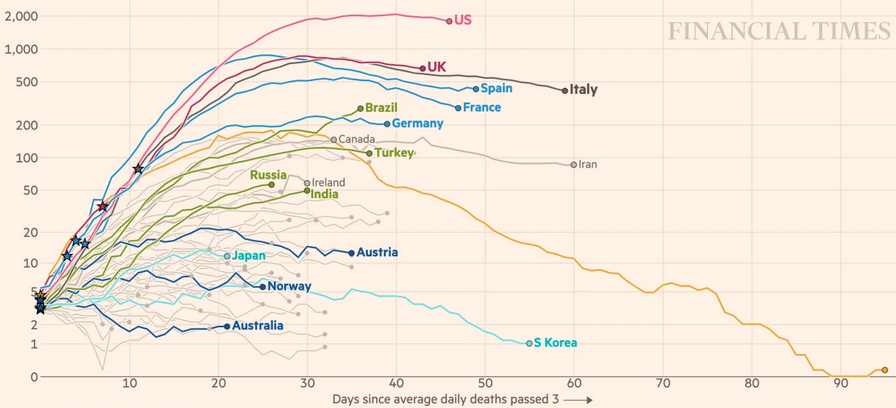
This non-cumulative chart is much better than the FT’s earlier efforts (though the fact that I’m still talking about these sensationalist earlier efforts is perhaps an indication of why newspapers are so irresponsible in their portrayal of data; universities and governments, too, enjoy the attention such sensationalism brings).
However, it’s still very difficult to tell from this chart the extent to which COVID-19 is getting better or worse (unless you’re really good at assessing the gradient by eyeballing a curve). Further, by focusing on absolute numbers, charts like this one make COVID-19 look far worse in larger countries like the US than in smaller countries like Italy, when the reality is the reverse: Italy has had far more deaths in proportion to its population than the US.
By plotting not the numbers of COVID-19 deaths but how much better or worse those numbers are week-over-week, I hope to give a more immediate impression of how the disease is progressing over time.
If it hasn’t already, I hope that your country dips deep into the green zone of my chart soon.
Subscribe now and I’ll let you know whenever I create a new visualization
It’ll only be every couple of months or so, I won’t let anyone else have your email address, and you can unsubscribe at any time
Thanks for subscribing!
Check your inbox for an email to confirm your subscription
Oh no, something went wrong, and I was unable to subscribe you!
Please refresh your browser and try again
Sources
time_series_covid19_deaths_global.csv from the Center for Systems Science and Engineering (CSSE) at Johns Hopkins University (JHU). This is the source data for their COVID-19 Dashboard. Accessed 19 September 2020.
How are the data points calculated?
The data point for each day is equal to the number of deaths in the previous 7 days divided by the number of deaths in the 7 days prior to that. For example, the data point for 29 April 2020 is equal to the number of deaths from 23 – 29 April inclusive divided by the number of deaths from 16 – 22 April inclusive.
This week-on-week rate of increase/decrease is plotted on a logarithmic scale from 15 times fewer deaths this week than last week to 15 times more deaths this week that last week.
What data points are included?
I’ve included data points for which:
- the number of deaths in the previous 7 days is more than 30, and
- the number of deaths in the 7 days prior to that is also more than 30.
These criteria are intended to exclude data points for which the numbers are so low that any week-on-week rate of increase/decrease is not meaningful. So where the line for a country disappears, as it does for China in early April, that’s a good thing: it means the numbers have fallen too low to show a meaningful trend.
Which countries are included?
I’ve included all countries for which:
- data is available from the Center for Systems Science and Engineering (CSSE) at Johns Hopkins University (JHU), and
- at least 30 days of data points are included according to the above criteria.
These criteria are intended to exclude countries for which too little data is available to show a meaningful trend.
Why use numbers of deaths rather than numbers of cases?
Using the number of COVID-19 deaths rather then the number of cases, confirmed or otherwise, has the disadvantage that my chart lags COVID-19 infections by about 18 days (“estimate of the mean time from onset to death… 17.8 days” – The Lancet – Infectious Diseases – Estimates of the severity of coronavirus disease 2019: a model-based analysis).
However, any measure of the numbers of cases of COVID-19 is highly dependent on testing rates, making comparisons between countries with different testing strategies unreliable. Though there may be failures to attribute COVID-19-related deaths to COVID-19 and, conversely, attributions of non-COVID-19-related deaths to COVID-19, the numbers of deaths are inevitably more reliable.
Date
First published 29 April 2020
 |
 |
 |
||
| Earth Elevation CROSS‑SECTIONS ALONG PARALLELS | At what age do we do our greatest work? | Commercials Consume Lives |
Comments
Click here to leave a comment
Thanks for your comment!
I’ll check it and put it live as soon as I can
Oh no, something went wrong, and I was unable to post your comment!
Please refresh your browser and try again
Sally Buck ⋅ 30 April 2020
Fantastic Mark, thanks so much for addressing this in a visual way that makes sense to the lay person, AND, for explaining why the various charts we see look different from each other and have the potential to mislead. This is a fabulous resource.
Excellent parting greeting: If it hasn't already, I hope that your country dips deep into the green zone of my chart soon.
Thanks again! Hugs from Vancouver.
Sally
Mark Jeffery ⋅ 30 April 2020
Thank you so much, Sally!
Hope you're doing well out there on the coast!