


Real World Colour Wheels
Notes
Forget about abstract theories of colour... these colour wheels are based on the real colours of real things in the real world
It has always bothered me that the colour wheels you see displayed everywhere from children's encyclopedias of science to photo editing software bears so little relation to reality.
I mean, why is so much of the colour wheel dedicated to greens, blues and purples, and so little to reds, oranges and yellows?
And what is that colour they call cyan? It's nothing like any colour I've ever seen in the real world. Sometimes, they call it aqua, but it's certainly not the colour of water. I've seen every shade of water, from deep tropical ocean to high mountain stream, and every shade of ice, from Arctic iceberg to Antarctic ice sheet, but I've never seen anything like cyan.
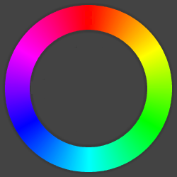 |
Colour wheel from Pixlr's free online photo editor |
Traditional colour wheels are based on abstract theories of colour that take no account of the exquisite range of colours in the real world or of our experience of them.
These real world colour wheels are based instead on the real colours of real things.
I generated them by searching for images of each of the real things named, then finding the dominant colour in these images. So it wasn't me who decided that lava is that hot orange-red or that swamps are that dull green-grey… those just happen to be the dominant colours in web images of lava and swamps.
Of course, these colour wheels, though more real than most, are only as real as they can be on an RGB screen you're looking at right now. If you really want to see real world colours, you're going to have to look up from your screen into the real world.
Subscribe now and I’ll let you know whenever I create a new visualization
It’ll only be every couple of months or so, I won’t let anyone else have your email address, and you can unsubscribe at any time
Thanks for subscribing!
Check your inbox for an email to confirm your subscription
Oh no, something went wrong, and I was unable to subscribe you!
Please refresh your browser and try again
More
Latest things made thinkable
Sources
I derived the colour of each of the segments of each of the real world colour wheels according to the following rules:
1. I searched for the real thing named, e.g. "aubergine", on Google Images.
2. I took a screenshot of the first page of results (move your mouse over any of the segments to show this screenshot).
3. I considered the hue, saturation and value of each pixel of the screenshot.
4. I gave less weight to pixels with low saturation, and ignored pixels with very low saturation, i.e. pixels that were almost white, grey or black.
5. I gave less weight to pixels with low value, and ignored pixels with very low value, i.e. pixels that were almost black.
6. Given this weighting, I found the range of hues that were dominant in the screenshot, i.e. the approximate colour that was most prevalent in the image search results.
7. Within this range of hues, I found the precise hue that was dominant in the screenshot, i.e. the precise colour that was most prevalent in the image search results.
8. Across all the pixels of this hue, I found the ranges of saturations and values that were dominant in the screenshot, i.e. how that colour tended to appear in the image search results.
9. I used the resulting hue, saturation and value for that segment.
I ordered the segments in each colour wheel by hue.
Date
First published 31 January 2016
Comments
Click here to leave a comment
Thanks for your comment!
I’ll check it and put it live as soon as I can
Oh no, something went wrong, and I was unable to post your comment!
Please refresh your browser and try again